Friday, 25 April 2014

Final Film Poster
For our final Film Poster, we have decided to use the poster experimentation 1 that we created all together. This is because we feel that this poster best represents our film, as it includes a lot of elements that we have used in our film trailer, for example the polaroid pictures that are all pinned to the wall and also the colours that were used. We also decided to use this film poster, as its very original as most film posters are not in the shape of a polaroid picture.

Thursday, 24 April 2014
Poster feedback
We asked 11 people for their opinion on the poster. We asked 4 questions which was based around what they liked, what they thought we could improve, what genre they thought the film was by looking at the poster and why they thought it was this genre. The genre is clearly presented through the poster with almost everyone asked chose crime.
What genre would you say the film was from looking at the poster?
Crime 8
Thriller 2
Realism 1
Name one thing you like about the poster?
Use of the polaroid image 6
Effect on the photo 4
Set up of the credits 1
Is there anything you would change?
Make the tagline easier to read 3
Colour of the tagline 2


Wednesday, 23 April 2014
Twitter Feedback
Once our trailer was completed we uploaded it onto the group twitter account and sent it directly to other media enthusiasts inviting them to comment on the finished piece. These were a couple of the responses:


Monday, 21 April 2014
Film Poster Image Effects
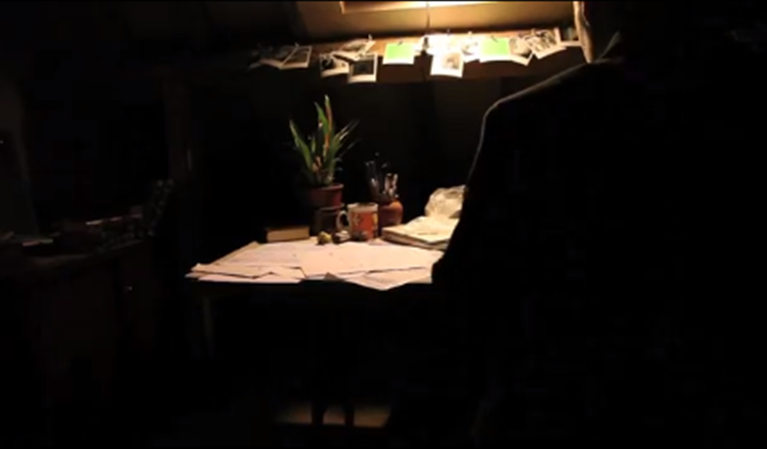
For the film poster, I took an image while on set of our film trailer of the polaroid pictures that we put on the wall above the detectives desk to put on our Instagram page to show evidence that were filming. However as I really liked the image I took, I put it as a possibility as the background of our film poster. As the image was very bright, I used the editing effects that Instagram offers to its users, when uploading picture to its software. I was able to focus on specific areas of the image, change the contrast, put an boarder around the image and also change the effects.
The original photo that I took:-

Some of the effects that I could have chosen:-
.PNG)
.PNG)
.PNG)
.PNG)
.PNG)
.PNG)
Image that we decided on:-
.JPG)
Sunday, 20 April 2014
Editing Schedule


Previous to 20th January we were filming for our trailer. The red boxes indicate the time that we were editing the footage for our first draft and after receiving feedback from a sample audience on 11th February, the green dates represent the editing for the final cut of the trailer. Editing dates include
- Putting the footage together
- Adding sound
- Adding titles and other credits
- Special effects work (including green screen editing)
The blue and yellow dates are when we were working on the ancillary tasks (the blue is the poster and the yellow is the website). These dates include doing work such as
- General designs for both
- Poster and website experimentation
- Image sourcing
- Adding credits and titles
Tuesday, 15 April 2014
Instagram Update
Throughout our project we have used social networking sites to promote our film trailer and also gain the attention of our target audience to see what they like about our film and what we could change if needed to. I uploaded pictures to Instagram and hash tagged the picture so that we were able to get more of our target audience to view our work. For our trailer we uploaded our final film poster to see what people think about it. We gained 11 likes and people commented say they liked it.

.PNG)
Friday, 11 April 2014
Shots used throughout our film Trailer

Throughout our film trailer, we have used a variety of different camera shots and angles to build up tension and create different effects. Below I have added stills from our film trailer, showing the different camera angles and shots that we used.
 |
| Long shot of the main character, showing his body language to the viewers. |
 |
| Close Up shot of Detectives hand, not revealing the identity of the detective, keeping it a mystery for the target audience. |
 |
| Medium shot of the main character in our film trailer, with the mobile phone she is about to pick, fading into the picture. |
 |
| Birds eye view of the detectives table, showing the evidence that is on it and also what the next shot in the film trailer is going to be. |
 |
| Low angle shot of the main actress, showing that she is vulnerable or will be vulnerable later on. |
 |
| Long shot of the mysterious box that the main character uses. You can also see another frame fading in, its the same box but in a different location. (Graphic Match) |
 |
| Medium Shot of the detective back, keeping his identity a secret from the viewers. |
 |
| Medium Shot, showing the two characters arguing and their body language. |
 |
| Close Up shot of victims hand tied up behind chair, not revealing face to keep it a mystery for the viewers. |
Thursday, 10 April 2014

Friday, 28 March 2014
Poster survey
Using a tally, I asked 20 people which poster out of three designs they thought should be used to advertise our film trailer. It was clear from the results that the first poster design was favourited was Poster 1 which obtained over half of the votes over posters 2 and 3.

From the most popular choice, I asked what caused them to choose that poster. The most frequent answer was that there was a link between the poster and the trailer as in the trailer, clips of the film are shown through Polaroid images and in the poster, stills from the film are shown on images within a Polaroid image which is framed by the general information included on a poster such as the age certificate, etc. Although from the other answers, thus poster also clearly shows the genre and teases the viewer by showing small parts of the film in the stills.

Thursday, 27 March 2014
Shot Experiment - Tied up hands
From our audience feedback after our first draft we gathered that in order to capture the audiences attention we should tease a little more of the main character's fate. As the film is quite dark we decided to experiment with some shots including blood and bruises, but nothing that will give too much away. Here is an experimental shot I took of bloody and bruised hands tied up, implying our main character was captured. I used the bruised make up look I previously experimented with and dipped my hands in homemade fake blood.
Friday, 21 March 2014
Technologies and Equipment
 Camera: - To film our trailer this year we
used a Canon 5d as apposed to the cameras provided for us by the school. This
improved our image quality by having a greater depth of field and exposure,
meaning we are able to achieve low-key lighting shots effectively as well as
have a clear focus on our image. The 5d also has in-built steadycam which will
be helpful for our tracking shots to reduce shakiness as we do not have a
dolly.
Camera: - To film our trailer this year we
used a Canon 5d as apposed to the cameras provided for us by the school. This
improved our image quality by having a greater depth of field and exposure,
meaning we are able to achieve low-key lighting shots effectively as well as
have a clear focus on our image. The 5d also has in-built steadycam which will
be helpful for our tracking shots to reduce shakiness as we do not have a
dolly. 
Microphone: - To record the sound for our
film trailer we used a ‘Zoom’ microphone used as a boom mic to capture clear
sound. This microphone has a better quality of sound than that on the camera
and therefore the diegetic sound of our trailer is clearer.

Editing: - As we are using a green screen
in our polaroids iMovie is limited for us editing wise, so we will use both a
combination of iMovie and After Effects to edit our trailer together. We intend
to use iMovie to cut the clips together and add any effects such as low
saturation or slow motion and then transfer the exported piece into After
Effects to layer the green screen.


Photoshop: - To edit our film poster this
year we are using photoshop. This provides a wide variety of tools we can use
to edit, therefore leaving us with unlimited possibilities for our poster.
Thursday, 20 March 2014
Potential Website Homepage

This is our draft for our potential website homepage. We decided to stick with the Polaroid theme as we have used this throughout our texts (trailer and poster), however we changed the background image to the detective to portray more of the conventions of the genre, Mystery. Once we have completed our final trailer we will upload it to the website and replace the video that is currently there which is the default Wix video.
Wednesday, 19 March 2014
Website Experiment

Whilst planning our website we decided to draft an option for it with the background appearing to be a pinboard with polaroids on it. However, after making a draft of this we decided against this draft as the colours do not fit well with the darkness of the movie and we would like the website, poster and trailer all to scheme nicely together. We would like to take the idea of using polaroids on our website further though as this is a theme that runs throughout our texts.
Costume & Make Up - Fake Blood
FakeBlood - Video Maker
Here is a short 'how-to' clip I made whilst experimenting with making fake blood. After reviewing our first draft we decided the trailer needed a 'bloody' shot to reflect the true darkness of the film's narrative. I used the recipe for making 'Dripping fake blood' on diyfashion.about.com as guidelines for my tutorial.
Monday, 17 March 2014


Saturday, 15 March 2014
Costuming & Make Up - On Set
For our costuming and make up we thought it would be important to have metaphorical reasonings behind certain aspects of each characters costume, making the scenes and characters easy to interpret and analyse, as well as giving the audience some background to their everyday lives.

In this scene of Alex and Stuart arguing we decided to have Alex wearing very casual clothes, with her hair tied back in a messy bun and no make up on. This implies that at this current moment in time she is not intending to go out, which is reflected in her actions as she is doing housework. She is also wearing a mans sweater, which belongs to Stuart. This, as well as her casual look, implies the two are very close and comfortable around each other, giving the audience an insight into their relationship. We decided to have Alex wear a white t shirt to metaphorically represent innocence, presenting her in this situation as pure and the victim in the argument. However, it could also be ironic, as the ring implies she is cheating on Stuart - appearances can be deceptive.

For the dinner scene we wanted to make it obvious to the viewer that this was a special occasion. To do this we chose Alex's outfit to be very dressy - a smart black dress and black heeled shoes - the 'little black dress' being a typical date/special occasion outfit for women. However, in this case we did not want to present Alex as innocent, and so we chose a tighter, short dress which is more flirtatious.

In terms of hair and make up for the dinner scene we decided to put Alex's hair half up to imply she was trying hard to impress someone, and also to pull her hair away from her face for practical reasons so it is easier to see her facial expressions on screen. We chose basic eye make up and specifically red lipstick, representing lust and love as well as the possibility of danger, which is then later shown when Stuart texts to say he cannot make it and Alex slams the plates down, implying she may the dangerous one.

The ring was incredibly important to the shoot as it implies that Alex has been cheating on Stuart as a ring is usually linked with the idea of marriage or promises. This is shown by the lengths Alex goes to to hide the ring from Stuart. We had Alex's nails a pale pink to imply femininity.

We wanted Stuart to seem fairly smartly dressed in comparison to Alex, so we dressed him in a shirt and smart work trousers. This implies he may have been out or working whilst Alex has been at home.

For the detective we decided to dress him in a simple green shirt and a black blazer with work trousers to show professionalism and imply he is working. The wedding ring implies he is mature or older. However, this could lead the audience into a false sense of trust in the detective due to his appearance of professionalism and security, adding to the mystery of the movie, as in the narrative of the real film it is revealed that he is not a real detective. The green of the detectives shirt could also represent jealous, which links with the jealousy he has of Stuart.

Subscribe to:
Comments (Atom)